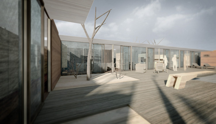
Arts & Architecture’s Case Study House program was supposed to be about creating replicable, affordable designs for post-war living—stylish but modest homes for young families on a budget. And then came house #17(2).
To be fair, this house was designed for real clients, with specific and ambitious requirements. The Hoffmans had four children, a household staff, and an art collection. So this was never going to be just another suburban three-bedroom.
It was, rather, a lavish five-bedroom residence complete with study, living room, dining room, and recreation room—not to mention the swimming pool, tennis court, children’s playground, maid’s quarters and workshop, and all fitted with top-of-the-line finishes and appliances. Although the rooms were modestly sized and the style as pared-down as any other mid-century minimalist design, this was a project on an entirely different scale.
Craig Ellwood—a man known for his own flashy lifestyle, who wrote in 1976 that the purpose of architecture was “to enrich the joy and drama of living”—must have relished the opportunity. Even the magazine’s editors got more than a little carried away, devoting a full 16 pages to this “good house and handsome object,” and gushing at length about the high specifications of the appliances and the vast number of closets.

In one respect, at least, this house was more in line with the average homeowner’s situation than many Case Study designs. The site was level and unexceptional, boasting no dramatic views to distract from or compensate for a small interior. Instead, the house wraps around an impressive courtyard with pool, encouraging residents to admire and celebrate their own property rather than a distant landscape, and turning the outside entertainment area into something of a theater; or, given the neo-classical aesthetic, perhaps a temple.
While the familiar Case Study design vocabulary—floor-to-ceiling glass, horizontal lines, steel frames, uninterrupted floors extending from the interior to the terrace—was applied here in service of a rather more hedonistic vision, it certainly upheld the program’s goal of reimagining modern living, in ways that translated well to countless subsequent homes. The kitchen in particular, with its bar-style island and sleek handle-free cupboards, would not look out of place in any newly built apartment.

Furniture chosen for its straight, sculptural lines and fixed to the walls contributed to the sense of the house as a complete design, with a monochromatic color scheme setting off the paintings displayed in gallery walls (another very current touch!) at the entrance and elsewhere.
And yet the actual owners were less thoroughly convinced; conflict over the stark aesthetic kept Ellwood from full satisfaction with his own creation, and the Hoffmans sold it after just six years, to a decorator who immediately pasted some pure Hollywood kitsch on top of this minimalist design. It’s hard to imagine why he wanted to paint the brickwork pink and wrap the terrace’s steel columns in pastiche Doric columns, but perhaps the pagan temple impression was just too powerful to ignore. Does walking through Archilogic’s wooden version of the house inspire you to imagine an alternative remodel?

Don't miss Archilogic's other models of Case Study Houses and seminal projects shared on ArchDaily—click here to see them all!


